Categories
Uncategorized

Gone but never forgotten: what we know about the mysterious Utah monolith

click the image to open a PDF of my diagram!

For my third and final illustrator project this semester, I wanted to challenge myself to do something different than my previous work, which was largely focused on pandemic-related stories about what’s happening in the world of entertainment. That was in part because there isn’t an easy subject matter to conceive of there that makes for a compelling diagram (a map of theater distanced-seating regulations? yawn), so I set my sights on something I thought would be more visually interesting: the now-vanished Utah monolith.

Admittedly, it’s lacking as a piece of subject matter in one key way for this project, which is that it’s not especially complicated to illustrate and its construction is fairly simple: three sides, a base, a top. The rest is all interior (and has never been/will never be seen) and/or speculated. To compensate for that I wanted to include more playful illustrations so that my diagram would still give me a chance to flex my illustrator muscles. The main illustration was the obvious choice, although I wish that I had actually left the monolith in the illustration there as a white skeleton like the one on the right, and then had the actual “diagram” be in color to add a more dynamic element to the main graphic. I also think that the white skeleton of the monolith looks a bit bland where it’s placed, and produces a weird chessboard effect where there’s color in the top right, middle left, and bottom right of the diagram. In hindsight I also think that I could have been more creative with the 2001 reference; if I were to go back and do this again, I would choose an even fatter slab font for “Strange Monolith Found in Utah” and stretched that text across all three columns, then converted it to outlines and used it as a clipping mask for a wider illustration of the monolith – that’s more fun! It’s less obvious in construction but also makes better and more interesting use of space, and doesn’t distract so much from the design of the news-worthy parts of the diagram so much.

I also added a map because it seemed to me that if the monolith itself is so mysterious in construction, then one of the more important things that *is* known about it is where it once stood.

Categories
A. Mattingly Diagram

Four Years of Billie Eilish

Click the image to see the enlarged infographic.

Billie Eilish, age 18, is one of the biggest and fastest-rising stars in the music industry today. After writing, producing, and releasing her first song, Ocean Eyes, at the age of 14, Eilish quickly rose to stardom and swept the 2020 Grammy’s, taking home 5 awards. Vanity Fair has interviewed Billie Eilish on the same day for four years in a row. As one of my favorite artists, I thought it would be interesting to illustrate Billie Eilish as she looked in each of the four interviews to show the change in her appearance over time, as well as her mindset as reflected in some of her answers.

In the past, I have been more focused on topics that deal with economic or social issues, but I decided to stray from that a bit with this project and focus in on something that I see as relevant to possible future careers. I’m super interested in music and pop culture, as well as vector art inspired by pop culture, so I decided to create a package that would be seen in a magazine, rather than a newspaper. While the style, in terms of color and layout, is much different than my other packages, I’m happy that I stepped out of my comfort zone and allowed myself to use colors other than black and white. I’ve mentioned color palettes as a big struggle for me in the other two projects, and I think the problem is that I was trying too hard to keep my style consistent with a newspaper piece, rather than letting my creativity take over. I did keep my typography consistent with my previous styles, apart from the large numbers displaying the years.

Overall, I am pretty happy with the layout, colors, and illustrations in this package. I was nervous that maybe it’s not explanatory enough to be considered a diagram, but I really wanted the focus to be on the change of Billie Eilish, in terms of looks and personality, throughout the past 4 years. Looking back, I probably should’ve incorporated some arrows to represent the idea of progression and made it more obvious the goal I had in mind. Similarly, after further inspection of my illustrations, there are some inconsistencies regarding the style of the four illustrations, and there are some tweaks I could make to ensure they all look cohesive.

Categories
Diagram T. Jackson

Penix tears ACL, out for season

My diagram of Michael Penix Jr.'s torn ACL.
Click the graphic for a closer look!

This project was really spur of the moment. I had an idea to break down the throwing motion of Peyton Manning, but I was having difficulty finding something to go off. I was with my girlfriend and she jokingly said to do something on Michael Penix Jr. and that gave me the idea draw a diagram of a torn because he suffered one. It was very quick, but I think the newsworthiness and the layout of this graphic makes it good.

I found the picture of Penix on Getty images and made the cutout, then found a diagram of a torn ACL on a health website. The rest was really simple, I used some of the elements of our past modules like the spotlight on his knee to show exactly what I was showing and some stats to fill space. I’m not a talented illustrator by any means, but something simple like a knee allowed me to put something together that didn’t require a lot of complex illustration techniques while still being able to give readers context to a big, relevant story. I’m really happy with how this turned out considering the late idea switch that happened and my lack of illustration skills.

Categories
Map T. Jackson
This is my map project, where I broke down the states with the most college football national championships and the best programs in Indiana.
Click the graphic to get a better look!

#9WINDIANA? Where IU football stands all-time

IU football is enjoying one if its best seasons of all-time this year. Not typically a powerhouse, IU has knocked off three top-25 teams this season and risen in the ranks to higher points than it has in decades.

For my project I wanted to look historically at where IU stands in the state of Indiana and where the state stands throughout the country. I used a choropleth to show which states have the most national championships all-time, then in a spotlight on Indiana I showed which states have spent the most time ranked in the Associated Press poll since it began. Ultimately, what it shows is Indiana is near the top in national championships all-time, all 8 of which have come from Notre Dame, and IU has spent less than 60 weeks ranked in the AP poll compared to Notre Dame’s 800+.

I think map does what I intended it to do well. I was hoping to show comparatively how poor IU’s football program has been compared to other schools in the state of Indiana. I used a lot of elements of map making that we learned in class and included a graph to add further context to the topic. Overall, I’m happy with what I came up with in this map.

Categories
Uncategorized

Traditional Chinese Food: Rice Dumplings (Zongzi)

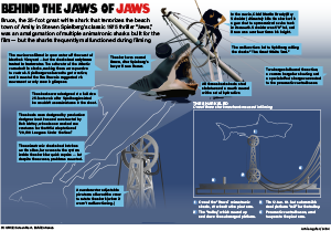
The diagram project is probably my favorite project this semester, and the one that took me the longest. In the previous two projects, I could usually finish it in three hours, but this one took me almost six hours.

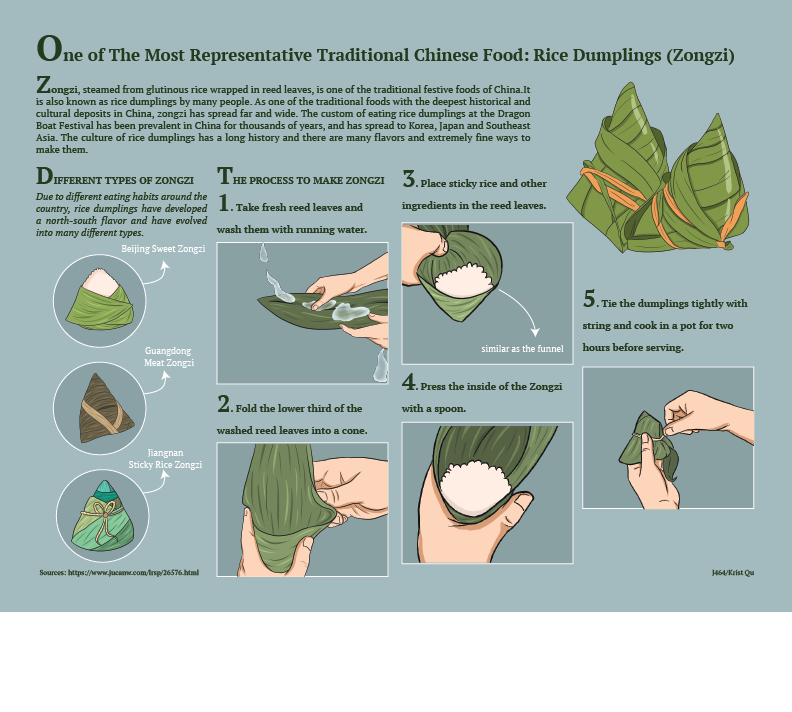
First, we’re going to combine illustrations and text to tell a story or explain a process. This was a very interesting process, because I’m not weak at drawing. I spent a lot of time thinking about what my theme should be, and the first thing that came to mind was to do an explanation of the sport of diving, because I thought it was really cool. But I wanted to make my theme more unique, because after all, the sports theme has been used by a lot of people. Then I thought of something with Chinese elements, Zongzi. I think that 464 is an international course and should be given a more diverse work.

Once I had decided on a theme, I started working on the idea of what I wanted to say. I was going to just do the process of making the zongzi, but then it occurred to me that my readers probably don’t have much of an idea or understanding of the Zongzi. So I was going to start with a brief introduction to the Zongzi, its origin and classification, so that my readers would have some basic understanding of it. Then I’m going to go into a little more detail about how to make Zongzi.

After finalizing these concepts, I started the layout. I started by writing a more detailed explainer about the zongzi. To the right of the explainer, I chose to put an obvious and eye-catching picture of Zongzi to show you what Zongzi looks like. Then below that are the types of Zongzi and how they are made.

I prefer drawing on my iPad to using the pen tool that comes with illustrator. illustrator’s pen tool is very convenient and helpful when making maps. But sometimes it’s awkward to draw curves, and the lines are not straight enough. Also, if I want to draw details, I need to adjust the screen size and strike repeatedly, which makes it difficult for me. So I decided to use procreate to draw a picture, export the picture as a PNG and paste it into the illustrator. The first thing I drew was the picture of the zongzi on the right side of the explainer. I didn’t expect that it would take me half an hour to do such a simple illustration. That’s because I used seven different layers, including the real thing and the shadows. Given the illustration’s style, I also added highlights to the Zongzi to make the illustration look more complete. After exporting the PNG, I thought the result was pretty good, with strong line and color expression. So I started to continue in this way for the image below. The next step is to draw the categories of the zongzi. I realized that the different types of dumplings differed in both shape and color, so I decided on my color card first, identified the colors I wanted to use, such as the different shades of green, and wrote down their color numbers in case I needed to use them again later. This section took about an hour of my time, because I wanted to make sure that the difference between the three different types of dumplings would be obvious to my readers at first glance. Lastly, I drew the process of making the zongzi. This step was the one that I found the most torturous and difficult, because it was different from just drawing the zongzi. I also had to consider the interaction between my hands and the zongzi, as well as the sense of space and volume. In the end, I’m going to use the actual photo as a reference for the painting. Thanks to my love of drawing comics, this kind of copying with a reference wasn’t very difficult for me. Although the drawing is finished, it doesn’t have any sense of volume, but looks more like a flat map. So I started to add shadows. Since there are no shadows in the photo, these shadows were more like visuals in my mind. For the shadows on the hands, I used a darker flesh color than the skin color to accentuate the depth. The same goes for the zongzi. I used six different shades of green to reflect the volume of the zongzi.Because the color cards were prepared in advance, the overall set does not feel disconnected, but rather looks very coherent.

If I have any regrets, I think it’s that I gave short explanations for each step, because I was on the heavy side and I was worried that a large explanation would clutter up the page.

From a design standpoint, since dumplings are usually green, I chose a starry blue background that matches the green perfectly, without clashing with the green or blurring it. Except for the large image on the far left, each illustration has a border, because I like the clarity of the outline. The fill color in the frame is a darker blue than the background color, which is also meant to create a visual effect. As a whole, I think I’ve kept the style consistent, and although my references are different, these illustrations can be seen to be by the same hand. This is one area where I feel I’ve improved.

Categories
Diagram S. Lloyd

The Right Way to Apply Skincare

Skincare routine infographic
Click the image above to see the full-size pdf.

This infographic assignment was covering diagrams. I decided to do a diagram about skincare and the right order to apply products because skincare has been an interest of mine lately. When I first learned about skincare routines, I had a hard time figuring out the right order to apply all of these products. I remember having to Google the correct order and do research on it.

I found a pretty extensive article on Cosmopolitan Magazine’s website on the correct order to apply products, so I used that as my main source. I stuck with a numbered list format in a grid because I wanted the information to be organized and easy to read. I wrote a short summary of each product and what it does, and some tips for application as well. For the bottom of the graphic, I had some extra space so I added a box for some extra steps.

For the illustrations, I decided to keep them minimal. I just wanted a basic shape for each product. Some I based on products that I own, and others I had to research and find a reference photo. I kept the same relative theme with the labels, overall shape design, and highlight lines. I added some bubbles/spots/squirts of product to add some interest throughout. For the extras box, I just made some simple icons with a white outline.

Overall, I think my graphic looks pretty clean. I kind of wish that I had ordered them a bit more creatively, but a classic grid is a good go-to. I also might have added some variety in the background by adding different colored boxes for each row or something similar. I like the color scheme, but it was difficult to choose between white or black text. I think that the full graphic itself is a bit easier to read than the thumbnail. It was interesting to do the research and I feel like I learned quite a bit. I might keep this graphic handy for when I want to update my own skincare routine.

Categories
Diagram J. Elliott

Rovers run the red planet

Click the image to see a full-sized PDF of the diagram.

I was considering doing a diagram on how to crochet simple stitches, or a diagram on how to make holiday drink cocktail. The idea of drawing a diagram on a rover came to me out of the blue. I knew drawing something as detailed as a rover would be a challenge. Though, I felt that my strongest skill in Illustrator is the pen tool and that I could created something that sort of resembled a rover.

I encountered a few hiccups during the design process. The first hiccup was me not knowing exactly how detailed a rover was. This setback my schedule, and I had to work overtime on this project. The second hiccup was after I had finished drawing the entire rover, I realized that I had not drawn the current rover that NASA has just launched into Mars in June 2020. I had actually drawn the NASA Mars rover from over 15 years ago. This rover was also a twin. NASA had sent two identical rovers into space in 2003. It turned out to be OK, as there were still some newsworthy elements with the previous rovers and a lot of good data on it. Lastly, I did not copy-edit as closely as I would have liked. After I had turned in my project I noticed in the explainer I forgot to mention the year that these rovers launched into space, which was 2003.

As for the design, I figured that creating an anatomical diagram of the Spirit and Opportunity rovers would be the best diagram. It was a little hard to draw some aspects of the rovers, because my reference photos were not actual photographs, but graphics rendered in a 3D program. I had to think a lot about depth and perspective.

Because there were two rovers, this gave me more wiggle room with where I wanted to place the information. I wanted the background to look like the rovers were on Mars. This required some tutorial watching on my least favorite Adobe program, photoshop.

Though I am not particularly interested in space, I found searching and learning about these two rovers and NASA’s mission for them quite fun.

Categories
Diagram M. Eslava

A pandemic check-up

When considering to dive into the subject of COVID-19 for the project, I considered what options I would have to create sort of diagram. I wanted to focus on the effects on mental health but there weren’t many detailed options to explain. So, I decided to focus on the tests themselves to show what each exam is and its importance to figuring out a person’s status. There is a fear with only having one option for testing and I wanted to provide the other saliva test as an example.

I searched for an image that would be able to give me a more detailed idea of what to base the diagram off. When looking for a way to provide more details about the saliva test, I considered the pieces of the test and its significance.

When placing the information I tried to have the illustrations break the grid slightly to make the overall project to have some change and dynamic element. Having parts of the saliva test explained with arrows and small bits of information give a bit more to look at for the graphic.

Categories
A. Aguiar Diagram

Behind the jaws of “Jaws”

A diagram showing one of the animatronic sharks from the movie "Jaws."
Click the image to see a full-sized PDF of the diagram.

I felt as if my previous projects for this class were a little lacking, so I really wanted to do something that pushed me and would be a really solid piece — at first I was thinking about doing an instructional recipe diagram for key lime pie (I love both eating and making key lime pie) or a step-by-step process for the old-school process of comic inking and coloring, but couldn’t find a way of doing the former I liked/wouldn’t be a bunch of glop in a bowl and couldn’t find a clear process source for the latter. This was my next idea, a diagram explaining the mechanisms and story of the animatronic sharks from “Jaws,” one of my favorite films ever. I didn’t realize until I was almost done, but this is now the second “Jaws”-related assignment I have done for a class taught by Steve Layton. What can I say? It’s a good movie.

I went in search of some resources for this diagram and a still from the movie I could confidently illustrate and combine a diagram version of underneath the water for that — luckily, “Jaws”‘ 40th anniversary in 2015 lead to a whole new round of nostalgia-driven content, including some looks back at the animatronic sharks Spielberg and company used in the film.

I knew that my illustration would be focused on the above-water action and the mechanisms below, but my original plan of having all of it in one component became a little unwieldy once I realized the scale of the mechanism that I wanted to recreate. I instead chose to break away the diagram into a box and have essentially two annotated diagrams, 1. the larger illustration and the top of the pivot arm to show dimensionality and share some tidbits from production and 2. the labeled workings of the so-called “shark sled” in an awkwardly left behind negative space to the lower right of the illustration.

Something I went back and forth on was how to treat the shark’s body underwater — while I had some useful resources of the opened-up body suspended above the water, I had nothing underwater AND assumed that they would of course shut the hatch for shooting underwater. I also wasn’t sure how to meaningfully render the above/under water difference between the two parts of the shark, and I think the outline approach for the submerged shark body works in this case and draws attention to the big old pivot arm he’s attached to. I also chose to not further illustrate the sinking boat, because I thought it would be a distraction, I didn’t have a reliable resource for it and most of it would end up being covered by the breakaway box and annotations anyway.

I’m especially proud of the larger illustration — a gradient mesh approach just wasn’t working for me on the shark’s head, so I ended up using a base color and doing a bunch of shapes that I then applied a Gaussian blur to to “blend” into the illustration. A clipping mask in the shape of the shark’s outline cleaned up any blur extending outside the lines, and it was done. Also, I spent a fair amount of time on the proper 3D effects for the pivot arm illustration, making a rectangular prism from 4 differently-rotated iterations of the 2D arm I drew for the shark sled diagram. Overall, I’m very happy with this!

Categories
M. Eslava Map

Indiana’s size in Education

When considering topics for this project I had decided to work on comparing information on polling locations in Indiana, but it came to be difficult to find polling locations for all the counties. So I decided to shift gears and focus on the number of higher education that is available in Indiana, as well as compared to other states in the United States. I researched the enrollment amount for colleges in Indiana and looked at the schools with the largest amount of enrollment. This showed Ivy Tech Community College with the highest number. I also decided to show the range of each states number of colleges that they have in their state.

I decided to grow with a green color pallet to keep the variation in color minimal since there was not much of a variety in the key colors being used. I showcased the US map with the gradient of color throughout to keep the color consistent. I attempted to incorporate more information, but I ran into the issue of having the data used for the assignment to make sense and correlate with one another.