
Click on the image for a PDF version of my graphic
There are many things that I liked about completing this map information graphic. One thing in general that I liked about this assignment, was that map graphics are more visual. Maps tend to capture my attention more and I personally think they are more fun to create. You can add more color, and more design elements to maps than you can with regular graphs.
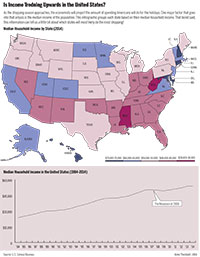
These graphics are about the median household income in the united states by state, as well as median income for the US from 1984 to 2014. In the map, I used different colors to represent the different levels of income in each state. I think that final product of this graph turned out pretty well and cohesively fits together, creating a pleasant graphic.