Boudia wins gold in the 10-meter platform

Meert_Diagram-Project
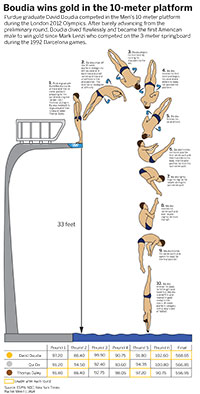
My diagram project is about the last dive Purdue graduate David Boudia performed at the London 2012 Olympics three years ago.This dive won him the gold medal in the Men’s 10-meter platform competition against China’s Qui Bo and Great Britain’s Thomas Daley. This win was especially important to the United States because it was the first gold medal and American male has won in the sport of diving since 1992 when Mark Lenzi won the gold in the Men’s 3-meter springboard competition at the Barcelona games.

Boudia performed a back two and a half somersaults two and a half twist as his final dive. He scored a total of 102.6 on the single dive, which brought his final score to 568.65, only 1.8 points above Qui Bo. This was one of the closest finals in Olympic history.

I really enjoyed this project. I picked a topic I was interested in and I want to believe it showed through my work. I spent a lot of time researching and drawing out the positions required by the dive. It was a little difficult at some times to make my drawings look realistic and accurate, but it was a good challenge and made me become more confident with the pen tool. This was by far my favorite project of the course because I was able to do more drawing than we have in the past.

Endangered orangutans found only in Southeast Asia

MAP_Meert

My map project was about endangered orangutans in Southeast Asia. My research showed that the only place where these endangered orangutans live are in the Indonesian islands of Sumatra and Borneo.

This project was very beneficial because it helped my drawing skills in Illustrator. I had never drawn in Illustrator before this class, and with this project, I was able to practice and perfect how to use the drawing tool.

The only problem I had when I was doing this project, is when I was finished drawing, I felt my graphic was very boring. I wished I had picked a more detailed graph that was more visually appealing. I tried to find data on the subject instead of just having maps, but I couldn’t find enough to do anything with it.

This problem will help me on the final project because it will make me think harder on my final topic so I won’t run into the same problem again.

College graduates do find jobs

Charts on employment based on education

Click on the image to see the full graphic.

My topic was unemployment and employment rates for people who are 25 and over based on their education levels. I thought this would be relevant right now because seniors who are graduating early are or should have already started looking for a job after graduation. The data I found from the Bureau of Labor Statistics shows that people who have a college education of some sort have a much higher chance of finding a job compared to others who have less education.

College students have been hearing that jobs are limited for the past few years, but as research from this past year shows, college graduates do find jobs. Whether their jobs are in the desired field or not, it does not specify. It only states whether or not the college graduate is employed.

I thought this project was a good summary of all the skills we have learned so far this semester. It was a challenge to put all of what I learned into one graphic, but I believe I accomplished that for my first at home project. The only problem I had was finding data that fit my topic and would be relevant if I attached it to the final graphic. The Bureau of Labor Statistics had a lot of valuable information that I wanted to incorporate, but after looking at my graphic carefully, I realized that the information was not relevant to the topic I was trying to address.