The Ten Most Populated Cities In California

Image

Heres a map style infograph about the population of cities in California.

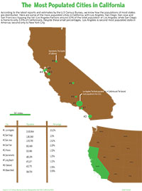
“Click on the image for a PDF version of my graphic”

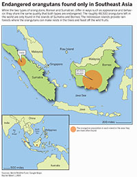
I found this project challenging because of the actual drawing component that was required. It was arduous to outline every little line of the state that I had based my data off and even after spending a couple of hours doing so I know it’s far from perfect. But at least I got something that sort of resembles the state of California so I’m happy with that.
Another challenging aspect of this project was, believe it or not, color. It was difficult to fill my outline of California with brown and green because of the way Id drawn it, the fill would sometimes go out of the map or there would be certain sections within it that would not fill(thanks to my awesome drawing skills). So I took the outline I’d drawn on Illustrator and moved it over to Photoshop, where I just filled in the colors I’d wanted. After doing so I brought the image back to illustrator and then I decided to create a proportional symbols map, because I wasn’t too familiar or comfortable with making a 3-D chart diagram and a locator map seemed like it would take forever to create,especially with all the nuances involved in drawing roads and locator symbols. So I decided that a proportional symbols map was the way to go. Granted, it is difficult to tell some bubbles apart but I think the numbers to the side and the scale I created beneath the map save the reader from total confusion. I didnt draw the north pacific ocean to the side because I thought it was unnecessary, especially for the purposes of this graphic. Maybe I could’ve marked the water body in the inset but that might’ve been too much.
The color scheme was decided upon spontaneously, I’m not sure why I chose green and brown but I sort of just went with it. The little design element done with the scale was also spontaneous. It doesn’t really relate to the topic I just thought it looked aesthetic. The inset to the bottom right was taken from the U.S map provided to us on the last deadliner. I followed the steps provided on the handout for the locator map to create to. This map was colored in Illustrator.
After all that the rest was a cinch. I wrote the Headline and a little but of body copy, scaled the graphic to meet the requirements and turned it in.
Looking at the graphic now, I think it might’ve been better if the inset actually looked like an inset as opposed to a random piece of the American map on the side. Maybe even a box to outline that this is not part of the original graphic.
I dont think this is a great graphic, by any means, but I don’t think its terrible either.

Household Income in the US

Click on the image for a PDF version of my graphic

Click on the image for a PDF version of my graphic

There are many things that I liked about completing this map information graphic. One thing in general that I liked about this assignment, was that map graphics are more visual. Maps tend to capture my attention more and I personally think they are more fun to create. You can add more color, and more design elements to maps than you can with regular graphs.

These graphics are about the median household income in the united states by state, as well as median income for the US from 1984 to 2014. In the map, I used different colors to represent the different levels of income in each state. I think that final product of this graph turned out pretty well and cohesively fits together, creating a pleasant graphic.

Map of NY,NY vs. SF,CA for Cost of Living

Hi! This is my graphic set for the Map project!

I decided to compare cost of living in San Francisco and New York City, because I was curious how they stacked up– I had read several articles over the past year when looking into places I might want to work after graduation, and it seemed to be a toss-up which one people claimed was more expensive. I chose to focus on Manhattan within NYC, because this contains the most stereotypical and prototypically-imagined NYC experience.

I based this graphic set off of census numbers, as data from a few other sources. One source, richblockspoorblocks.com proved to have some really interesting data visualization of income numbers based off of the 2013 census, so they were a huge asset– unfortunatly, they charged for a person to use their site for more than a few searches, limiting their helpfulness. Numbeo was useful in providing percentage stack ups by category, based on data in the same census.

When evaluating my final pictured version of this map pack compared to the first version of this graphic (not pictured, for your own good– it was very bad), it is safe to say my final graphic is a solid representation of the data I found. There is obviously room for improvement, especially as this class does not come naturally to me, but I am for the most part immensely proud of what I eventually produced.

Room to Improve:
I could have added more data labels and better call-outs to label cities or landmarks. I tried to do this, but struggled to integrate it without overpowering the other data, so I ended up getting rid of it. If I did a next version of this, that would be what I would strive to find a way to add, to improve the usefulness of the graphic. This considered, I still feel my graphic accomplishes a lot without these labels– thus why I ended up turning it in as-is.

Things I Did Well: 
I like my color scheme– It feels very in character and earth-toned. I like my choice to omit water, as it makes it feel cleaner and more modern to me this way (in keeping with the newer flat design styles I see around). I like my key and how I displayed it with circles, and I am really proud of my chosen data displaying method for the bottom 3 graphics, where I made the illustrative objects myself, to provide quick meaning and contribute additional depth to my graphic. I like the way I demonstrated percentage difference in these same images, using scaling and a green bar only measuring change in height to clarify this is the only scaling I am trying to use (as opposed to percentage of the whole object– I chose to use just height scaling as a form of measurement in change, that is). I also was proud of my proportional symbol map to show NYC vs. SF population on the reference map.

I hope you like it! (It took a LOT of hours to make).

This is my graphic pack for the map project! I wanted to compare cost of living for NY, NY and SF, CA.

This is my graphic pack for the map project! I wanted to compare cost of living for NY, NY and SF, CA.

map_lent final

Kevin Wilson’s Recruiting Pipeline

Enlarge to see full graphic

Enlarge to see full graphic

For my map project, I decided to dissect IU football head coach Kevin Wilson’s recruiting trends across the United States. Wilson has struggled in the Big Ten conference during his time at IU, so I thought it would be interesting to see if it has anything to do with where he recruits his players.

He took over the football team in 2011, immediately beginning recruiting for the 2012 class. For this project I compiled his recruiting classes from 2012 to his latest in 2015, using the database on 247sports. During my research I found he gets most players in-state, but also recruits heavily in Georgia and Florida.

When I was growing up, I was obsessed with recruiting players in the NCAA Football video games. The game would highlight the states where you get the most recruits for your team, so I used that as inspiration. The term “pipeline” is used in this game and among college football analysts to describe where a university gets its players, and I decided to keep this in mind while working on my map project.

One of the hardest things to sort out was players recruited out of junior college. Four players were from junior colleges in Iowa, but I ended up finding where these JUCOs were originally went to high school. I also had to cross-reference with the final team rosters at IU Athletics to make sure Wilson’s recruits made it to school. Some players never reported to camp due to academic or personal reasons, so I omitted them from the final data set.

By the end of this project, I learned the importance of distinct-but-related color schemes. It was challenging to figure out what shades of red to color the states based on the number of recruits. But after it was all said and done, this project ended up being fun to work on.


Endangered orangutans found only in Southeast Asia

MAP_Meert

My map project was about endangered orangutans in Southeast Asia. My research showed that the only place where these endangered orangutans live are in the Indonesian islands of Sumatra and Borneo.

This project was very beneficial because it helped my drawing skills in Illustrator. I had never drawn in Illustrator before this class, and with this project, I was able to practice and perfect how to use the drawing tool.

The only problem I had when I was doing this project, is when I was finished drawing, I felt my graphic was very boring. I wished I had picked a more detailed graph that was more visually appealing. I tried to find data on the subject instead of just having maps, but I couldn’t find enough to do anything with it.

This problem will help me on the final project because it will make me think harder on my final topic so I won’t run into the same problem again.

Attractions people love most in Yellowstone National Park

Map chart of top attractions in Yellowstone National Park

Click on the image for a PDF version of my graphic

Yellowstone National Park is one of the most famous parks in the world. It attracts thousands of people to visit every year. However, there are so many attractions in the park that many people have no idea which one to visit. My goal for this project is to create a map chart that can clearly tell people what top ten attractions are and where they located in the park.

It took me some time to look for data. There are so many different data of what the top ten attractions are. However, I decided to use the data from Yellowstone Net, one of the most authorized websites for Yellowstone National Park.

There are many map graphs for Yellowstone National Park already. However, most of them are too complicated and hard to read. Therefore I decided make a map that only includes important elements of the park and make it easy to understand. I chose blue color for lakes and brown color for land of the park in order to match people’s common perception of how they look. I tried white color for roads first but it did not show very well on my light brown color land. Therefore I changed the color of roads to yellow. I followed our J464 style guide to use Myriad Pro and BentonSansCond Bold* because I think they look very nice on my design.

As for the composition, I wanted to place five images of attractions on the left side and the other five on the right side – just as how people normally do.
However, I realized that there is an insert map that takes quite a lot of space on the right side of the page. Therefore I decided to place four images on the left side, and the other six images on the right side with two columns in order to balance the height of two sides.

I learned a lot from the project. I am much more comfortable with using Illustrator and pen tool now. And I am more proficient with making scale. Overall, I am satisfied with my design. But there are still some things that I want to do but I did not know how to do it, such as creating texture. I believe that I can make it nicer after I learn more about Illustrator.

Where is the Starbucks loved the most?

Click on the image for a PDF version of my graphic

Click on the image for a PDF version of my graphic

On this project, I wanted to give big picture of where Starbucks is loved the most. Largest visual was given to the U.S. map because it is the most relevant for imaginary audiences in the U.S. Other two sub-visuals show where Starbucks is loved the most world widely; by city and country.

There is nothing specially surprising and new that I learned as I researched the topic as I already knew that Starbucks is the top coffee chain especially in the world wide view. It was not too surprising to see that Starbucks is most popular in the west side of the States as Starbucks started from San Francisco, although the top state that has most Starbucks store was the D.C. The final version did not show because it was not very relevant to the topic, but I looked at Starbucks’ annual report from 2008-2014 to have a more comprehensive view on how Starbucks is doing. The reports show that it has been expanding and growing steadily when it is already the largest coffee chain in the world. It was impressive to see the growing rate. Also, as I came from South Korea, I knew that we have A LOT of Starbucks in Seoul, but I didn’t know we had the most number of Starbucks stores in the world.

Doing this project made me to be more comfortable with Illustrator and in using pen tool. Drawing the whole US map did take much time but somehow I enjoyed it because I didn’t have to think very much to draw the map. I like what the new pen tool does. I used to have a hard time to grasp idea on how the pen tool will draw, but the new feature makes drawing much easier for me.

What I like about my work is that I could give in where Starbucks is loved and how much within the U.S. and also in the globe. I also like the structure of the charts. However, I feel like the color could be more diverse. I tried to have a color theme as Starbucks’ official color with a little bit of coffee color such as on words under the map, but using more of the brown color on the sub visual could be better.

Rent Across Chicago- Nitahara

click on image for a PDF version of my graphic

click on image for a PDF version of my graphic

For my map project I debated different topics for a long time. I ended up choosing a map of Chicago because it’s my hometown, and I knew I would still be learning something new on the city. I decided to look into the rent prices in various Chicago neighborhoods and turn the data into a chloropleth map. I’m thinking of moving back to Illinois after graduation, and would love to live in the city if I am offered a job there. I thought this graph could not only be helpful for me, but for a lot of other soon-to-be college graduates in a similar situation to mine.

The first step to this map project was actually drawing out the city of Chicago. Going into the project I wasn’t aware there were 76 neighborhoods in the city, so it took me longer than I thought it would to make the map. I grew up in Skokie, which is a northern suburb of Chicago. I spent most of my time in the northern neighborhoods and around the downtown area growing up, so I was able to learn about some of the more southern and western neighborhoods in Chicago. I had never even heard of some of them. The median rent in a lot of neighborhoods were lower than I thought, and some of them were a lot higher than I was expecting.

As a whole, I am proud of what I accomplished in this project. I was having trouble using the pen tool in Illustrator when it was first introduced in class. Drawing this map gave me a lot of practice and now I feel comfortable using it. This project also showed me how important it is to get reliable data from the same source. When I first began research I wasn’t able to find rent prices for some of the smaller neighborhoods, so I would use a different source. I didn’t realize that some of the prices listed were averages, and some were median values. Luckily, I was able to find another source that was consistent with the data it provided.