Nike Chart Package

Charts on Nike Brand

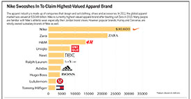
Click here to see full graphic

This chart package gives an overview on Nike’s current apparel industry status. They have recently become the top fashion retailer in the world. I wanted to do a topic in fashion because I’m interested in that industry, specifically fashion public relations, for a career. My main chart is a horizontal bar graph showing the values of the top ten apparel retailers in the world. Because Nike is currently the highest valued, I looked into the company further. I also decided to add a line graph comparing Nike’s revenue over a span of 10 years with the revenue percent change. Lastly, I added in two pie charts. One showed how much of Nike’s brand revenue came from each of their major locations. The final pie chart breaks down where most of Nike’s factory employees are stationed.

While researching this topic I was able to read about the top 10 fashion retailers in the world. I was surprised by some of the brands on the list. I also was able to look deeper into Nikes growth and current status, which I may have never looked into if it weren’t for this project. I also learned that Nike makes it’s quarterly fiscal reports available on their website, which was very helpful in my research. Not only did I broaden my knowledge on Nike, but on using Illustrator as well. I had to apply what we had been learning in class to my own work, and it was exciting to see the results.

All in all, I think the package turned out okay. I had never used Illustrator before this class, so for my first project I thought I did well. I didn’t realize how time consuming all of the research and planning would take. I also spent a lot of time fixing tiny details and changing my mind on layouts and colors. I found it difficult to organize the charts in a cohesive way.

Dirty Diesel

Charts on Diesel in Vw

Click this thumbnail to see the full graphic.

This charts package presented an opportunity to learn tons of new details about a field that I haven’t yet learned much about – the auto industry. The recent VW emissions scandal raised several questions in my mind- How extreme was the disparity between what VW claimed and what it was actually doing; What effect does this have on human health and environmental health; and What are the implications of this scandal for the rest of the auto industry?

The first bar chart shows the difference in NOx emissions between the amount measured during EPA testing and the amount the VW cars are estimated to actually be emitting when used on the road.

The VW symbol in the center is a pie chart showing the percent of VW’s U.S. sales that are diesel vehicles – a vast majority.

The second bar chart compares diesel fuel in general to other types of fuel. Diesel is and has long been considered a dirty fuel.

Digging in to the emissions data published by the EPA was a challenge. There were about 36 columns and 5000 rows in the databases I chose to use. The terminology and abbreviations in the data sets were hard to decipher, but with a few calls to EPA employees and about 10 total minutes of talking over the phone, my questions were answered. I was able to draw meaning from the data sets and select only the cars and emissions I found interesting: the cars were the diesel-fueled models implicated in the EPA’s notice to VW, and the emissions were NOx, methane, N2O, and particulate matter.

I think the suggestion that I rearrange the charts, so that the testing-vs.-real-use comparison runs horizontally along the top, and the fuel type comparison hugs the bottom right corner, is a good one. I think making that change would bring the package together to have a more complete look, and the reader’s path through the information would be more clear. Next time, I will seek feedback on organization of package elements before I submit the finished piece.

Using Illustrator was really fun, and I am becoming more comfortable with it. The deadline really inspired me to pick up speed; hopefully I’ll be able to zoom through simple tasks in the future. Gotta build up that muscle memory.

I would like to further draw comparisons among fuel types and engines by comparing CO2 output and fuel efficiency. Similarly, I’d like to provide more context for readers. I think the emissions information could mean much more to readers if were made more clear why these emissions are harmful and at what levels they start to really cause problems. Then I could show how many cars are on the road, how big of a problem these engines are in general, and how big of a problem the VW engines are in specific.

All in all, I had a great time working on this project, and I am excited to do more of this visual presentation of data and reporting on interesting information.


Chart Package About Cars Versus Drivers

Hi! This is my first project for Infographics. I know it is not the best thing ever (I have a long way to go to improve, in this class) but I would like to note that I was light-years away (in terms of skill) from producing even this basic chart package a few mere months ago.

Things I could have worked on:
I really needed to find a way to have connected data, but was struggling to connect multiple data sets to this one topic (probably because I disliked my topic). To fix this I should work with data I like more and have a greater connection to– a process I would like to learn how to get started on, as the semester moves forward. I also struggled with type sizes and when to use caps, as well as differentiating between subheadings, labels, and explainers. I’m eager to improve on these things, and make more effective charts in the future.

Things I think I did well on:
I like my color scheme, after I implemented edits. Although it notably feels very… University of Oregon. That was an accident. I also like my car drawing. Most of all, I like the way I creatively used space, and avoided more rectangular containing of information, an element of my design that I think that leant a heavier magazine-design feel to this project.

Things I learned from, and hope to improve:
It turns out, I’m definitely not naturally gifted at the art of infographics– but that’s okay, because I’m really determined to improve. I learned that there are a lot of areas one can make errors, that some data becomes old and isn’t very useful, and that data collection is tremendously difficult even if you know what you want to learn about. Next time, I’d like to focus more on how to collect my data, to make sure I work with things I find more personally relevant, interesting, and enjoyable. I think that first step could push the end product to be significantly better, because my intrinsic motivation to see something beautiful come together would be a lot higher.

Cars vs drivers chart

The number of cars is greater than the number of drivers, and is continuing to grow!

From College to MLB

Charts on Kyle Schwarber

Click on the image to see the full graphic.

I started my freshman year at Indiana University by taking pictures of the Hoosier baseball team, led by Kyle Schwarber and company. He was known to hit many home runs for the Hoosiers, and he carried his team to the 2012 College World Series. Then, after his junior year he entered the 2014 MLB Draft and was selected 4th overall by the Chicago Cubs. It was not long before he worked his way through the farm system and found a spot in the Cubs starting line-up.

Schwarber instantly made an impact in the line-up for the Cubs. Throughout his 2015 rookie season, Schwarber hit 16 home runs in only 69 games. Although his home runs were impressive, I also noticed he tended to strike out too much. So, because he played catcher through college and wants to play the same position in the Majors, I wanted to compare how much he struck out compared to other notable catchers in their rookie seasons. With simple math, strike-outs divided by plate appearances, I was able to find his strike-out rate, along with many other players’.

I wanted to keep in mind the increasing ability for pitchers to strikeout batters (the average strike-out rate has risen over 10 percent in the Live Ball Era). But after finding out Schwarber’s strike-out rate was 8 percentage points higher than the 2015 average, I figured it was something to look into more.

For the glory of Old IU — Chart

Chart package on the history of IU men’s basketball since 1940

I thought a chart package on IU basketball would be appropriate since the season is about to start, and everyone is really excited thanks to Hoosier Hysteria and students receiving tickets in the mail. I also wanted to show IU’s strong basketball history. I thought there would be a more comprehensive database, but I had to mostly comb through the IU Athletics archives PDF and make my own spreadsheet. They have literally everything anyone would ever want to know about IU basketball, so I spent a lot of time going through the data and trying to figure out what would be relevant from the huge amount. I decided that the overall records would be the focal point and most relevant and interesting. I also wanted to show who was the coach at the time and how they did in the tournament. I started at 1940 because that was the first National Championship, and otherwise there would’ve been way too much. Then I thought it would be relevant to display some stats from last season since the team will be building on that.

I’m very happy with how my chart package turned out overall. I chose reds because of the correlation with IU, and I didn’t want to really use any other colors to distract from that. I used greys where reds would be too much. I really like how the reader can either just glance at the bar chart of records throughout history or go deeper and look underneath to see how far they got and who stopped them. I didn’t realize until it was too late that the bottom red wasn’t from my swatches and was slightly different. Also, if I could go back, I would make the 2012-13 charts smaller and maybe make more. There’s a lot of loose space around them. Overall, though, I really enjoyed the process of going through data and continuously adding information to the graphic, and I’m happy with the end result.