The life cycle of a butterfly

Click on the image for a PDF version of my graphic

Click on the image for a PDF version of my graphic

My topic is about how a caterpillar turns into a beautiful butterfly. A butterfly has to go through a four-stage life cycle to turn into an adult beautiful. It starts its life as a butterfly egg and hatch from the egg as a caterpillar. Then, the caterpillar forms itself into a pupa for weeks and finally comes out the pupa as a beautiful butterfly. The life cycle is long and complicated. Therefore, I decided to create a process diagram to show those four stages respectively. My goal is to make the diagram clear and easy to read that all people, even kids can understand.

I got my information and data from The Butterfly Site, the number one butterflies information source. The biggest challenging was that I had to look at a lot of pictures to see how butterfly eggs, caterpillars, and pupa look like. I don’t like to see butterfly eggs and caterpillars normally. But I know I have to see them very carefully in order to draw an accurate graphic.

Usually when people draw a diagram about life cycle, they like to use the circle life cycle template. But I want to try something new. I noticed that all those four stages happen on branch. Therefore I decided to draw a long branch and the four stages respectively on the branch. I draw a description box under each stage and connect the images and boxes with arrows.

As for color, I tried to choose color that reflect the way objects look – green for leaves, brown for branch, and colorful color for butterfly, etc. What’s more, I applied gradient on them to make them look more vivid.

All in all, I am happy with how my diagram turned out. I think it meets my goal – clear and easy to understand, and I am satisfied with it.

Project 3, Mel Lent

This is my diagram project! I diagramed out a phone application that could exist, as a prototype map. I use it to demonstrate the customer journey (visualizing the steps the customer would take to use the application leading to purchase and receipt of goods), and to map the respective user experience. The goal of this application is to provide a unique fast-fashion approach to accessorizing through use of an application-centric commerce site, drones, and 3D-printing. Some of the current components (drones and 3D-printing, to be exact) would need to experience technological advances in speed and affordability for this business model to succeed, but that isn’t to say it couldn’t work out in the future after key advancements have been made!

I struggled a little with the perspective grid tool, but got better as I went, particularly with using it to modify text shapes. Eventually, I discovered I was just making everything more complicated, and that was the central source of difficulty for me.

I really like how this turned out! I know my color scheme is unusual, but I think it captures the flavor of the application. I am really proud of my progress with the perspective tools, such as those needed to make the phone 3D, as well as those needed to warp the text to fit. I really think this project got me to practice a range of techniques I learned in and out of class, and made me a stronger diagram-designer. I had a lot of fun designing my own application prototype as well through this assignment, from the top down. I think I learned a lot, and got to apply some of the things I’ve learned about branding across my coursework at IU. I also wanted to add that I left out the credit line because the idea was from me, and because ideally I’d feature this in media other than a newspaper where the credit line went above the graphic. This was fun!

This is my final project-- a step-by-step diagram of an app that does not yet exist!

This is my final project– a step-by-step diagram of an app that does not yet exist!

Arsenic in Plants: How a Toxin Finds its Place and Wreaks Havoc in a Plant

Click on the image for a PDF version of my graphic.

Click on the image for a PDF version of my graphic.

I had a lot of fun making this diagram, and I think this time I picked a topic I could conquer in the time I was given to finish the graphic.

I find the subject of toxin contamination of soils and water to be very interesting, and I’ve learned more about it this year than ever before (through this class, a plant physiology class, and an inorganic chemistry class). Toxins in soil can have a massive impact on health. In areas where contamination is a major health issue, toxins can contribute to political and socioeconomic injustice. In areas where it is a minor issue, people still have reason to be concerned about it- metals in the body are no joke, and while some of them are necessary for life (Fe, Zn, Mg, etc.) others are very, very bad.

I am curious about how these bad metals get into our bodies – through water, air, skin contact, and food. This project tackles the food issue.

I chose arsenic because it is a fairly evocative toxin. People recognize the name and respond to it pretty strongly, so I thought it would have some news value. And I decided using an unambiguously bad element was a good idea. There are plenty of metals that are good in low doses but bad if the dose is too high- but I decided getting into that kind of detail would be too complicated for my diagram. That was a good choice.

I am happy with the overall look and layout of the diagram. If I made changes, I would shrink the soil and expand the sky just enough to put up a small map showing Bangladesh, or a small chart showing a) amounts of arsenic in agricultural crops (on the left of the stem) and another small chart showing b) the number of human deaths/year due to arsenic, or the number of people exposed to unhealthy levels of arsenic every year, by country (to the right of the stem).

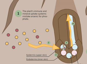
I also would like to make the cutaway diagram more realistic and 3D-looking. I think it gets the point across, but it looks a bit chunky and amateurish.

I’m digging the roots, though.

The cutaway diagram doesn’t include all the parts of the root structure, but it does include the parts relevant for understanding how arsenic gets into the plant and travels through it, which is the point of the diagram.

I’d like to get into more detail about the actual mechanism of transport of arsenic through the plant. Like what exactly ferries it around? Some sort of protein or enzyme, or is it just dissolved in the water?

I did make a chart of the number of people exposed to unhealthy levels of arsenic every year, by country, but the numbers are just so astronomically different from one another that I decided to leave it out. It appears that arsenic poisoning is not really a worldwide issue; most countries do not have very high levels of As in the water and soil. Certain countries, however, do. Bangladesh has it worst, followed by Mongolia and Thailand. The numbers of people exposed were 30,000,000 in Bangladesh, 300,000 in Inner Mongolia, 2,000 in Thailand, and 300 in U.S.A. These numbers were just so widely different that I didn’t think a chart was that informative (even though I really really wanted to put it in).

For your interest, there is a curious reason Bangladesh’s numbers are so enormous. In the 1970s, humanitarian efforts were made to improve the water quality in Bangladesh, which at the time was suffering from a lot of water-borne infectious disease (due to pathogens). So relief organizations came in an helped dig a bunch of wells, all to more or less the same depth. Unfortunately, there happened to be a very high concentration of arsenic present at that depth- it is just a feature of the geology of the area. So all the water that comes from these wells has way too much arsenic in it, and the Bangladeshi people are continually poisoned by it.
So that is a problem.
One solution is to dig the wells deeper, so that they pass this arsenic layer. That will take lots of time, money, and labor, but it will help with the problem.
That’s my knowledge on the topic, I will read more about it and get a better understanding of what’s happening with that situation.

I really wanted to go more in depth with the specific effects of arsenic, biochemically, in both plants and in animals. I think that would be interesting, to talk about why it is so bad for humans. I was glad to explore the plant side of things, though, because a) plants are cool and don’t get enough attention or credit and b) it’s important to understand plant physiology if I want to understand how eating the plants affects human health. Know thyself, know thy food.

Feedback is appreciated, I am interested in pursuing this project further as well as applying a similar template to other toxins.

Stress on the body

Click on the image for a PDF version of my graphic!

Click on the image for a PDF version of my graphic!

While I was trying to come up with some sort of process the I could visually represent, I couldn’t help but think to myself, how stressed I was. After a couple of days of contemplating ideas, it finally hit me. I decided to do an annotated and process diagram of how stress affects the body. I narrowed it down to the five major systems or areas that become compromised when the body undergoes stress. I started with the brain, then heart, the digestive system, the immune system, and finally the muscles. In each step I explain how this part of the body is effected by stress.

Personally, I found the idea of creating icons to be the most fun when it came to the diagram project. I could have done a cutaway version of the body explaining what happens inside the body when stress occurs, however I loved the idea of creating my own depictions of the body parts and adding a little but of design and color to them. I wanted to create a graphic that was clear, concise, easy to follow, and somewhat modern and simplistic.

Pointe Shoe Diagram

Click on the image for a PDF version of my graphic.

Click on the image for a PDF version of my graphic.

I took a lot of time to decide on a topic for this final project. I was bouncing ideas for a long time but decided to go with something I was passionate about. I’ve been dancing since I was about three, but unfortunately that came to a halt when I got to college. I miss it a lot and I’m always interested in learning more about the art of dance so I chose an aspect of ballet for this diagram. This piece is a cutaway diagram that shows the inside of a pointe shoe. I wanted to show the main parts of the many that go into producing just one shoe.

Since I was never trained intensely in ballet, making this diagram on pointe shoes taught me a lot. I wasn’t aware of some of the terminology used, and didn’t know how much went into producing the shoe. I love watching ballet because of how effortless it looks, while knowing how intense ballerinas train to achieve this effect. After completing research for this project, I appreciated pointe shoes in the same way. They look so dainty and pretty, covered in pink satin. If you look up close, you can see that they are actually very strong and each pair is very carefully crafted.

I had a difficult time finding a way to lay out all of the information in my graphic. I felt that no matter what I did the page looked crowded, so I played around with different colors and positions. I wanted to make sure the illustration of the shoes were the main focus, but needed to find a way to incorporate all of the descriptions and additional information. I ended up choosing lighter pastel colors because I thought they went the best with the color of the shoes, and portrayed the feeling I get when I watch ballet.

Overall, I’m happy with how everything turned out. I thought I used a lot of what we learned in our class, especially the pen tool! Of all the assignments, this was my favorite to create. I hope to continue to use the skills I’ve learned in this course in the future. I think they could be extremely helpful whether I end up in a design field or not.