Pointe Shoe Diagram

Click on the image for a PDF version of my graphic.

Click on the image for a PDF version of my graphic.

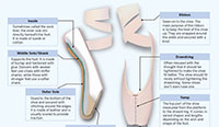
I took a lot of time to decide on a topic for this final project. I was bouncing ideas for a long time but decided to go with something I was passionate about. I’ve been dancing since I was about three, but unfortunately that came to a halt when I got to college. I miss it a lot and I’m always interested in learning more about the art of dance so I chose an aspect of ballet for this diagram. This piece is a cutaway diagram that shows the inside of a pointe shoe. I wanted to show the main parts of the many that go into producing just one shoe.

Since I was never trained intensely in ballet, making this diagram on pointe shoes taught me a lot. I wasn’t aware of some of the terminology used, and didn’t know how much went into producing the shoe. I love watching ballet because of how effortless it looks, while knowing how intense ballerinas train to achieve this effect. After completing research for this project, I appreciated pointe shoes in the same way. They look so dainty and pretty, covered in pink satin. If you look up close, you can see that they are actually very strong and each pair is very carefully crafted.

I had a difficult time finding a way to lay out all of the information in my graphic. I felt that no matter what I did the page looked crowded, so I played around with different colors and positions. I wanted to make sure the illustration of the shoes were the main focus, but needed to find a way to incorporate all of the descriptions and additional information. I ended up choosing lighter pastel colors because I thought they went the best with the color of the shoes, and portrayed the feeling I get when I watch ballet.

Overall, I’m happy with how everything turned out. I thought I used a lot of what we learned in our class, especially the pen tool! Of all the assignments, this was my favorite to create. I hope to continue to use the skills I’ve learned in this course in the future. I think they could be extremely helpful whether I end up in a design field or not.

Nike Chart Package

Charts on Nike Brand

Click here to see full graphic

This chart package gives an overview on Nike’s current apparel industry status. They have recently become the top fashion retailer in the world. I wanted to do a topic in fashion because I’m interested in that industry, specifically fashion public relations, for a career. My main chart is a horizontal bar graph showing the values of the top ten apparel retailers in the world. Because Nike is currently the highest valued, I looked into the company further. I also decided to add a line graph comparing Nike’s revenue over a span of 10 years with the revenue percent change. Lastly, I added in two pie charts. One showed how much of Nike’s brand revenue came from each of their major locations. The final pie chart breaks down where most of Nike’s factory employees are stationed.

While researching this topic I was able to read about the top 10 fashion retailers in the world. I was surprised by some of the brands on the list. I also was able to look deeper into Nikes growth and current status, which I may have never looked into if it weren’t for this project. I also learned that Nike makes it’s quarterly fiscal reports available on their website, which was very helpful in my research. Not only did I broaden my knowledge on Nike, but on using Illustrator as well. I had to apply what we had been learning in class to my own work, and it was exciting to see the results.

All in all, I think the package turned out okay. I had never used Illustrator before this class, so for my first project I thought I did well. I didn’t realize how time consuming all of the research and planning would take. I also spent a lot of time fixing tiny details and changing my mind on layouts and colors. I found it difficult to organize the charts in a cohesive way.

Rent Across Chicago- Nitahara

click on image for a PDF version of my graphic

click on image for a PDF version of my graphic

For my map project I debated different topics for a long time. I ended up choosing a map of Chicago because it’s my hometown, and I knew I would still be learning something new on the city. I decided to look into the rent prices in various Chicago neighborhoods and turn the data into a chloropleth map. I’m thinking of moving back to Illinois after graduation, and would love to live in the city if I am offered a job there. I thought this graph could not only be helpful for me, but for a lot of other soon-to-be college graduates in a similar situation to mine.

The first step to this map project was actually drawing out the city of Chicago. Going into the project I wasn’t aware there were 76 neighborhoods in the city, so it took me longer than I thought it would to make the map. I grew up in Skokie, which is a northern suburb of Chicago. I spent most of my time in the northern neighborhoods and around the downtown area growing up, so I was able to learn about some of the more southern and western neighborhoods in Chicago. I had never even heard of some of them. The median rent in a lot of neighborhoods were lower than I thought, and some of them were a lot higher than I was expecting.

As a whole, I am proud of what I accomplished in this project. I was having trouble using the pen tool in Illustrator when it was first introduced in class. Drawing this map gave me a lot of practice and now I feel comfortable using it. This project also showed me how important it is to get reliable data from the same source. When I first began research I wasn’t able to find rent prices for some of the smaller neighborhoods, so I would use a different source. I didn’t realize that some of the prices listed were averages, and some were median values. Luckily, I was able to find another source that was consistent with the data it provided.