Click on the image for a fill size PDF version of my graphic.
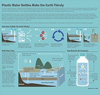
My diagram is about water mining and plastic water bottle. There are many discussions about why bottled water is good or bad, or if people should drink tap water more than bottled water because of health, environment, and etc. However, there are not many discussions regarding water itself. I tried to focus on the side that is not talked too much about; how plastic water bottle that we consume because it’s convenient and taste good deplete water from ground and harms the environment to a point that the land loses its power to restore itself. I tried to show the process of water mining in a detail and just a little bit of a side note, I put a little bit of information on water bottle consumption. It was a subject that I knew nothing about until a few weeks ago when I talked with my friend who is very environment-conscious. I knew about landfill problems and health problems that are caused by plastic water bottle, but I never thought about the water itself. As I did research, I found many surprising, but natural fact that water in bottled water is mined from some place, not anywhere nearby where I live, and delivered to me. It was a simple fact but a bit shocking at the same time. I am obviously not the only one who drinks bottled water, and the bottled water companies that I buy bottled water from are huge multinational companies. Where does all the water come from?
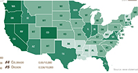
I tried to find actual places where bottled water companies actually draw water, but it was not easy because it was more of inside issue. I did find some places, however, I decided to use just general information on aquifer because 1) I thought it was a better idea to give general information than focusing on one specific location’s information, and 2) it was hard to obtain specific information about the sites anyway.
I wish I could put more information on the diagram because there are so much more than a few sentences. I tried by best to put as much as information as possible regarding the process of putting diagram and the water cycle. I also feel like the color theme could be better, but it was the best I could. I did not want it to be too lively because water mining and depletion is a depressing issue. I also feel like I could be more clear on the connection between bottled water and water depletion, but I had to be satisfied with what I wrote on the article body due to lack of space. Another thing that I am not quite satisfied with is the water cycle drawing. I did my best, but it looks too simple.
I learned a lot from this project. For information-wise, I did not know anything about water mining and plastic, so I learned a lot for this project. I knew about the water cycle, but aquifer was a fresh knowledge for me. Regarding design, I definitely became more comfortable with illustrator. I drew a lot of icons, also, so I learned a lot about creating icons, having fun with lines and arrows.
Things that I like about my piece are 1) structure and 2) icons. Although I am not satisfied with the water cycle diagram, I like the rest of the drawings. I spent much time designing the icons and modifying them, but it was fun.
Overall, this assignment was the hardest one. I had a hard time to even pick the subject- I changed the subject four times; at first it was coffee, at second it was cold cases of children kidnap in Japan, and third was Korean traditional palaces. Although it was tough to complete the assignment, I like the result. I am personally happy to have a chance to learn illustrator. There is more than a plenty of room to grow, but compared to the beginning of the semester when I did not know anything about illustrator, I improved a lot. It was the hardest, but it was worth it, and I’m happy with the result.