Project 3, Mel Lent

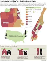
This is my diagram project! I diagramed out a phone application that could exist, as a prototype map. I use it to demonstrate the customer journey (visualizing the steps the customer would take to use the application leading to purchase and receipt of goods), and to map the respective user experience. The goal of this application is to provide a unique fast-fashion approach to accessorizing through use of an application-centric commerce site, drones, and 3D-printing. Some of the current components (drones and 3D-printing, to be exact) would need to experience technological advances in speed and affordability for this business model to succeed, but that isn’t to say it couldn’t work out in the future after key advancements have been made!

I struggled a little with the perspective grid tool, but got better as I went, particularly with using it to modify text shapes. Eventually, I discovered I was just making everything more complicated, and that was the central source of difficulty for me.

I really like how this turned out! I know my color scheme is unusual, but I think it captures the flavor of the application. I am really proud of my progress with the perspective tools, such as those needed to make the phone 3D, as well as those needed to warp the text to fit. I really think this project got me to practice a range of techniques I learned in and out of class, and made me a stronger diagram-designer. I had a lot of fun designing my own application prototype as well through this assignment, from the top down. I think I learned a lot, and got to apply some of the things I’ve learned about branding across my coursework at IU. I also wanted to add that I left out the credit line because the idea was from me, and because ideally I’d feature this in media other than a newspaper where the credit line went above the graphic. This was fun!

This is my final project-- a step-by-step diagram of an app that does not yet exist!

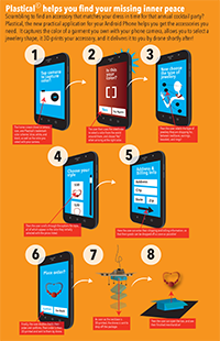
This is my final project– a step-by-step diagram of an app that does not yet exist!

Map of NY,NY vs. SF,CA for Cost of Living

Hi! This is my graphic set for the Map project!

I decided to compare cost of living in San Francisco and New York City, because I was curious how they stacked up– I had read several articles over the past year when looking into places I might want to work after graduation, and it seemed to be a toss-up which one people claimed was more expensive. I chose to focus on Manhattan within NYC, because this contains the most stereotypical and prototypically-imagined NYC experience.

I based this graphic set off of census numbers, as data from a few other sources. One source, richblockspoorblocks.com proved to have some really interesting data visualization of income numbers based off of the 2013 census, so they were a huge asset– unfortunatly, they charged for a person to use their site for more than a few searches, limiting their helpfulness. Numbeo was useful in providing percentage stack ups by category, based on data in the same census.

When evaluating my final pictured version of this map pack compared to the first version of this graphic (not pictured, for your own good– it was very bad), it is safe to say my final graphic is a solid representation of the data I found. There is obviously room for improvement, especially as this class does not come naturally to me, but I am for the most part immensely proud of what I eventually produced.

Room to Improve:
I could have added more data labels and better call-outs to label cities or landmarks. I tried to do this, but struggled to integrate it without overpowering the other data, so I ended up getting rid of it. If I did a next version of this, that would be what I would strive to find a way to add, to improve the usefulness of the graphic. This considered, I still feel my graphic accomplishes a lot without these labels– thus why I ended up turning it in as-is.

Things I Did Well: 
I like my color scheme– It feels very in character and earth-toned. I like my choice to omit water, as it makes it feel cleaner and more modern to me this way (in keeping with the newer flat design styles I see around). I like my key and how I displayed it with circles, and I am really proud of my chosen data displaying method for the bottom 3 graphics, where I made the illustrative objects myself, to provide quick meaning and contribute additional depth to my graphic. I like the way I demonstrated percentage difference in these same images, using scaling and a green bar only measuring change in height to clarify this is the only scaling I am trying to use (as opposed to percentage of the whole object– I chose to use just height scaling as a form of measurement in change, that is). I also was proud of my proportional symbol map to show NYC vs. SF population on the reference map.

I hope you like it! (It took a LOT of hours to make).

This is my graphic pack for the map project! I wanted to compare cost of living for NY, NY and SF, CA.

This is my graphic pack for the map project! I wanted to compare cost of living for NY, NY and SF, CA.

map_lent final

Chart Package About Cars Versus Drivers

Hi! This is my first project for Infographics. I know it is not the best thing ever (I have a long way to go to improve, in this class) but I would like to note that I was light-years away (in terms of skill) from producing even this basic chart package a few mere months ago.

Things I could have worked on:
I really needed to find a way to have connected data, but was struggling to connect multiple data sets to this one topic (probably because I disliked my topic). To fix this I should work with data I like more and have a greater connection to– a process I would like to learn how to get started on, as the semester moves forward. I also struggled with type sizes and when to use caps, as well as differentiating between subheadings, labels, and explainers. I’m eager to improve on these things, and make more effective charts in the future.

Things I think I did well on:
I like my color scheme, after I implemented edits. Although it notably feels very… University of Oregon. That was an accident. I also like my car drawing. Most of all, I like the way I creatively used space, and avoided more rectangular containing of information, an element of my design that I think that leant a heavier magazine-design feel to this project.

Things I learned from, and hope to improve:
It turns out, I’m definitely not naturally gifted at the art of infographics– but that’s okay, because I’m really determined to improve. I learned that there are a lot of areas one can make errors, that some data becomes old and isn’t very useful, and that data collection is tremendously difficult even if you know what you want to learn about. Next time, I’d like to focus more on how to collect my data, to make sure I work with things I find more personally relevant, interesting, and enjoyable. I think that first step could push the end product to be significantly better, because my intrinsic motivation to see something beautiful come together would be a lot higher.

Cars vs drivers chart

The number of cars is greater than the number of drivers, and is continuing to grow!