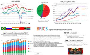
BRICS is a global organization consisted of five developing countries, which represents large land area and population.
I thought this topic is interesting because the BRICS organization was not well-known by majority people, but the five countries consisted of, are control great deals of human, natural, and military resources in the world. Also, the World Bank database is helpful, which including literally every data of every country that you can imagine of. Another motivation of doing this chart was an article I read online. That article talked about decline of Russia, how loose population policy of India going to affect its future, how military purchase of India from Russia going to affect its overall strength in Asia, critically thinking of post-Mandela South Africa, how Brazil new president upgrade Brazil from export raw material to service industry, and of course, booming and unbalances wealth distribution of China.
My purpose of doing those charts are demonstrate how global economic in last decade brought to these five countries that are changed dramatically and could be seen as locomotive and rising star of world economy. Specifically, how bad the economic crisis turbulence affects each country? How quickly each one able to recover from it? Is there any country’s curve differ than others, what are the reasons underneath of this/ these unusual curves? Additionally, when we look at those five countries, we can see totally different characters of them. Some of them were seen as great power of the world, such as Russia, some of them were seen as booming dramatically such as China, some of them were seen as economic heavily rely on political struggle such as South Africa, some of them were seen as dominant by leisure and entertainment industry, which hard to associated with strong economic power, such as Brazil, some of them were seen as future power, making great use of its population resource, such as India. Those characters add more meaning and fun when comparison them at the same page.
The reason that I choose the GDP, GDP per capital, and export as my content is for the GDP and GDP per capital, they are often being misled and misused. We should see these two data more rationally rather than radically. For the export, it is the factor that shows the degree of independent of a country’s economy, and how long a country able to survive in extreme conditions such as If biggest trading partner turns to enemy. Also, economic crisis (the trend) reflects best at this index, since countries are heavily interrelated under globalization.
I feel ok about this assignment, given by limited time I left for myself. I changed my topic couple times, some of them hard to come up with multiple charts to perfectly represent it; some of them hard to find data in the format that I want. I have rush time on writing interpretation part, so, hopefully not too bad.
