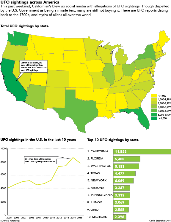
For this graphic, I created 3 images. One of the traced map, which showed a generalization of where UFO sightings were reported, a line chart that showed how many UFO sightings per year, and finally a bar chart saying how many sightings the top 10 states have had.
I came across this idea when I was on social media and I saw a lot of posts about a supposed UFO sighting in California. It peaked my interest and I decided to do further research to see if I could find detailed reports of how many UFO sightings there were. Luckily for me, those who have seen UFO’s keep very detailed records of all of the instances in the United States and Canada. I wanted to add another graphic that had information from International sightings but apparently only North American UFO enthusiasts keep detailed records of the UFO sightings.
Some improvements I could make would be my callouts. I struggle with having important information in callouts. I feel like I just repeat obvious information in my graphics, I would like to get better with callouts so I can add more interest to my graphics. I also hastily traced the map, not creating individual states originally, so I became very familiar with the scissor tool. The scissor tool is genius and I will forever be grateful that I wasn’t forced to retrace the whole entire country.
I chose the green color scheme because aliens are usually associated with green. I thought it was a fairly obvious transition to go from less sightings with yellow and represent the most sightings with a deep green. Overall I think that I got the point across with my graphic. However, I do need to be more creative when designing the set up of my graphic. My past two projects have been arranged the same, and I know that I can be more creative than that. Besides learning about the godsend that is the scissor tool, I also learned that if you want to see UFO’s you should probably travel to California.