
Hi! This is my first project for Infographics. I know it is not the best thing ever (I have a long way to go to improve, in this class) but I would like to note that I was light-years away (in terms of skill) from producing even this basic chart package a few mere months ago.
Things I could have worked on:
I really needed to find a way to have connected data, but was struggling to connect multiple data sets to this one topic (probably because I disliked my topic). To fix this I should work with data I like more and have a greater connection to– a process I would like to learn how to get started on, as the semester moves forward. I also struggled with type sizes and when to use caps, as well as differentiating between subheadings, labels, and explainers. I’m eager to improve on these things, and make more effective charts in the future.
Things I think I did well on:
I like my color scheme, after I implemented edits. Although it notably feels very… University of Oregon. That was an accident. I also like my car drawing. Most of all, I like the way I creatively used space, and avoided more rectangular containing of information, an element of my design that I think that leant a heavier magazine-design feel to this project.
Things I learned from, and hope to improve:
It turns out, I’m definitely not naturally gifted at the art of infographics– but that’s okay, because I’m really determined to improve. I learned that there are a lot of areas one can make errors, that some data becomes old and isn’t very useful, and that data collection is tremendously difficult even if you know what you want to learn about. Next time, I’d like to focus more on how to collect my data, to make sure I work with things I find more personally relevant, interesting, and enjoyable. I think that first step could push the end product to be significantly better, because my intrinsic motivation to see something beautiful come together would be a lot higher.
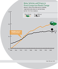
The number of cars is greater than the number of drivers, and is continuing to grow!