
Click this thumbnail to see the full graphic.
This charts package presented an opportunity to learn tons of new details about a field that I haven’t yet learned much about – the auto industry. The recent VW emissions scandal raised several questions in my mind- How extreme was the disparity between what VW claimed and what it was actually doing; What effect does this have on human health and environmental health; and What are the implications of this scandal for the rest of the auto industry?
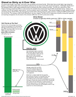
The first bar chart shows the difference in NOx emissions between the amount measured during EPA testing and the amount the VW cars are estimated to actually be emitting when used on the road.
The VW symbol in the center is a pie chart showing the percent of VW’s U.S. sales that are diesel vehicles – a vast majority.
The second bar chart compares diesel fuel in general to other types of fuel. Diesel is and has long been considered a dirty fuel.
Digging in to the emissions data published by the EPA was a challenge. There were about 36 columns and 5000 rows in the databases I chose to use. The terminology and abbreviations in the data sets were hard to decipher, but with a few calls to EPA employees and about 10 total minutes of talking over the phone, my questions were answered. I was able to draw meaning from the data sets and select only the cars and emissions I found interesting: the cars were the diesel-fueled models implicated in the EPA’s notice to VW, and the emissions were NOx, methane, N2O, and particulate matter.
I think the suggestion that I rearrange the charts, so that the testing-vs.-real-use comparison runs horizontally along the top, and the fuel type comparison hugs the bottom right corner, is a good one. I think making that change would bring the package together to have a more complete look, and the reader’s path through the information would be more clear. Next time, I will seek feedback on organization of package elements before I submit the finished piece.
Using Illustrator was really fun, and I am becoming more comfortable with it. The deadline really inspired me to pick up speed; hopefully I’ll be able to zoom through simple tasks in the future. Gotta build up that muscle memory.
I would like to further draw comparisons among fuel types and engines by comparing CO2 output and fuel efficiency. Similarly, I’d like to provide more context for readers. I think the emissions information could mean much more to readers if were made more clear why these emissions are harmful and at what levels they start to really cause problems. Then I could show how many cars are on the road, how big of a problem these engines are in general, and how big of a problem the VW engines are in specific.
All in all, I had a great time working on this project, and I am excited to do more of this visual presentation of data and reporting on interesting information.