
Click on the image to see the full graphic.
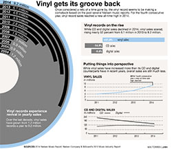
A few years ago, I started collecting vinyl records, and recently it seemed like a lot more people were starting to, as well. I wanted to see if that was just something I was experiencing, or if there really was a growing trend, and if so, by how much. For data on this topic, I looked to Nielsen Music Reports of the past several years, and found that there was in fact, an increase in vinyl sales. Not only that, but it was a significantly large one.
To present this data, I knew I wanted to utilize the circular shape of a vinyl record somehow, but that took some time to figure out. I ended up creating a bar chart and then using the arc tool to curve it into a half circle. The other charts I made were for the most part, pretty straightforward.
Overall, I’m happy with how my chart package turned out. I think my main graphic turned out cool and that the other three charts support it well.