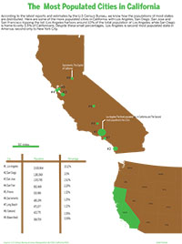
I found this project challenging because of the actual drawing component that was required. It was arduous to outline every little line of the state that I had based my data off and even after spending a couple of hours doing so I know it’s far from perfect. But at least I got something that sort of resembles the state of California so I’m happy with that.
Another challenging aspect of this project was, believe it or not, color. It was difficult to fill my outline of California with brown and green because of the way Id drawn it, the fill would sometimes go out of the map or there would be certain sections within it that would not fill(thanks to my awesome drawing skills). So I took the outline I’d drawn on Illustrator and moved it over to Photoshop, where I just filled in the colors I’d wanted. After doing so I brought the image back to illustrator and then I decided to create a proportional symbols map, because I wasn’t too familiar or comfortable with making a 3-D chart diagram and a locator map seemed like it would take forever to create,especially with all the nuances involved in drawing roads and locator symbols. So I decided that a proportional symbols map was the way to go. Granted, it is difficult to tell some bubbles apart but I think the numbers to the side and the scale I created beneath the map save the reader from total confusion. I didnt draw the north pacific ocean to the side because I thought it was unnecessary, especially for the purposes of this graphic. Maybe I could’ve marked the water body in the inset but that might’ve been too much.
The color scheme was decided upon spontaneously, I’m not sure why I chose green and brown but I sort of just went with it. The little design element done with the scale was also spontaneous. It doesn’t really relate to the topic I just thought it looked aesthetic. The inset to the bottom right was taken from the U.S map provided to us on the last deadliner. I followed the steps provided on the handout for the locator map to create to. This map was colored in Illustrator.
After all that the rest was a cinch. I wrote the Headline and a little but of body copy, scaled the graphic to meet the requirements and turned it in.
Looking at the graphic now, I think it might’ve been better if the inset actually looked like an inset as opposed to a random piece of the American map on the side. Maybe even a box to outline that this is not part of the original graphic.
I dont think this is a great graphic, by any means, but I don’t think its terrible either.
Author Archives: Ankit Kotwal
P.H.Ds in America on the rise
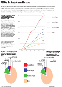
This charts project was particularly challenging but not for the reasons I had expected. The first challenge was that I hadn’t given myself enough time to meet the deadline; I had around 72 hours to gather all my data, arrange it and then design it to make it a presentable infographic. The second, and most surprising challenge I found, was finding the data. In class we’re often led to our sources because we know what we’re searching for, that is, the topic is given to us. But when you have no clue and are left to search the vast expanse of the internet for something relevant and, add to that, credible, the search gets even more complicated.
After figuring out what I wanted my chart to be about and finding the data that I wanted to work with, the other complication arose of making sense of the data. I decided to show how the number of Americans with higher education degrees had increased over the last seven years through a line graph charting the percentage change. I also decided it would be relevant to show two pie charts showing the composition of the candidates from the total population in 2014 and 2009.I thought about gathering data before 2009, but the problem was that one of the links were broken for the year 2008, or the year 2002. So I figured 2009 was just fine.
The execution part was surprisingly not as difficult as the search, I had enough time to complete the chart, add in all the pointers and color everything to a key. I figured this part would’ve been more difficult given my limited skills with illustrator but I was mildly taken aback by the final chart.
A big issue I had with the chart was that there was way too much space which I had to fill in with the keys. Also the pie charts took on an odd oval shape after I scaled them to fit the grid.
For the next assignment I plan to start earlier and have a clearer idea of what I’m presenting and how I’m going to present it, to create a better infographic.


