Project 3 – Northern lights diagram

NorthernLights For this project I decided to create a graphic of how the northern lights are created, and a scale to show what causes the different colored lights.

I’ve taken a few astronomy classes so I was familiar with the creation of the northern lights. I traced the countries on the earth from a picture taken from google, and I knew what solar flares looked like so i drew them from memory.

I used the gradient mesh tool on the sun to get the effect of the sun being on fire, for the rest I used the pen tool. The scale of the colors I created with the square shape and the gradient tool.

I think I did a good job of clearly showing the process of how the northern lights are created for those who aren’t familiar with the sciences. This graphic was created with a textbook in mind which is why it has more of an educational tone to it.

UFO sightings across America


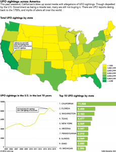
For this graphic, I created 3 images. One of the traced map, which showed a generalization of where UFO sightings were reported, a line chart that showed how many UFO sightings per year, and finally a bar chart saying how many sightings the top 10 states have had.

I came across this idea when I was on social media and I saw a lot of posts about a supposed UFO sighting in California. It peaked my interest and I decided to do further research to see if I could find detailed reports of how many UFO sightings there were. Luckily for me, those who have seen UFO’s keep very detailed records of all of the instances in the United States and Canada. I wanted to add another graphic that had information from International sightings but apparently only North American UFO enthusiasts keep detailed records of the UFO sightings.

Some improvements I could make would be my callouts. I struggle with having important information in callouts. I feel like I just repeat obvious information in my graphics, I would like to get better with callouts so I can add more interest to my graphics. I also hastily traced the map, not creating individual states originally, so I became very familiar with the scissor tool. The scissor tool is genius and I will forever be grateful that I wasn’t forced to retrace the whole entire country.

I chose the green color scheme because aliens are usually associated with green. I thought it was a fairly obvious transition to go from less sightings with yellow and represent the most sightings with a deep green. Overall I think that I got the point across with my graphic. However, I do need to be more creative when designing the set up of my graphic. My past two projects have been arranged the same, and I know that I can be more creative than that. Besides learning about the godsend that is the scissor tool, I also learned that if you want to see UFO’s you should probably travel to California.
map

Coach Crean’s history with IU basketball

Charts on Indiana University basketball

Click the image to enlarge the graphic.

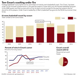
With basketball season approaching there has been a lot of talk about coach Crean and Indiana University’s mens basketball team and how they will perform this season. For my graphic I used three charts, one showing IU’s overall record since Crean has been IU’s coach. My second graphic was the winning percentage of IU since Tom Crean has been our coach, and my final graphic was comparing his percentage of wins at Marquette and Indiana.

The final chart is slightly problematic due to the fact that Marquette is in a smaller conference and not as strong as a basketball conference. I thought the information was still relevant though because IU and Marquette had similar trends with Crean’s coaching, except IU’s wins fell the last few seasons.

The one chart I wish I could have included in this graphic was one showing player retention or the amount of times players got in trouble. The reason I didn’t do this was because it was challenging to find this information. If I would have had more time I would have researched this. I already had to create my data from scratch which was very time intensive. If there were ready-made spreadsheets for this data I would have been inclined to do the extra research for the player retention.

I used IU’s cream and crimson for my colors and navy blue to represent Marquette because their colors are gold and dark blue.