
 For the chart project, I chose to research something that has always interested me and something that I already know a great deal about. As an environmental management minor, I’ve spent a good amount of time researching data sets similar to what I used.
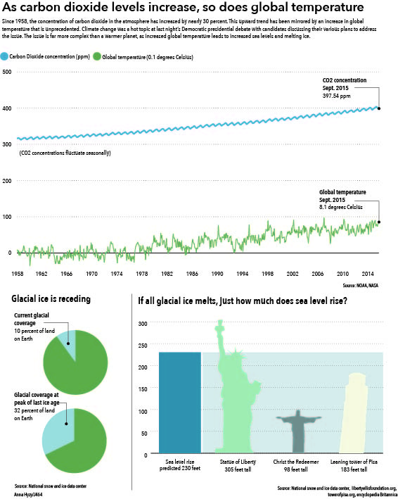
I definitely underestimated how complex it was to display this data set. While I think I did so in a somewhat effective way, i definitely could have done a lot better and presented the data in a way that could have been much clearer. I really enjoyed comparing the rise in sea level to well known landmarks to put the height in perspective.