
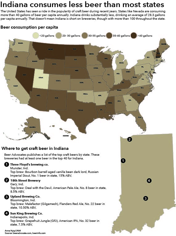
 For this project, I researched beer consumption per capita across the country. Then, to make the infographic more localized, I located the most highly-ranked craft breweries in Indiana.
I actually really enjoyed this project. The subject was interesting to research and I had a lot of fun with the color palette. The color palette was also a challenge. I wanted it to be somewhat evocative of beer, though I worry that I may have chosen a color more representative of coffee. I was aiming for a scale that would go from a stout color to a wheat ale color, but I do feel I missed the mark to some degree.
It was interesting to do the local research on breweries as well. As someone who’s not from Indiana, I’m not as familiar with which names carry weight here since I haven’t grown up around them.