
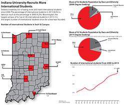
Chart package on diversity change on IU campuses since 2000
I decided to make a chart package on the diversity in IU for several reasons. First of all, I am an international students and this topic is closely related to my life. Secondly, I did notice that the number of international students hugely increases compared to four years ago when I came to IU. Lastly, it seems that no one ever made a chart package on this topic before. Therefore I think that it is a good topic for my assignment.
It took me quite a while to find data. IU does have enrollment reports each term. But they are separate report, meaning that I have to put all the data from each year together by myself. Moreover, IU does not provide enrollment records that are prior to 2000 to public, which means that I cannot make graphics that I really want. That is, to show the trend from the year IU was founded to now.
However, I know this is a problem that every infographic designer may come across—sometimes you just can’t find data that you need. Anyway I decided to use the data that I got to make graphics. I compared the 2000 data to the 2015 data and show the change. Fortunately, it turned out well.
I chose and red as the main color for my graphics because it representing IU. I use dark grey and deep grey to replace white because I already have white as my background color. Overall, I am satisfied with what I did so far. It was a very fun experience.