Diagram: Deforestation in Haiti

Click image to view full pdf of diagram.

Click image to view full pdf of diagram.

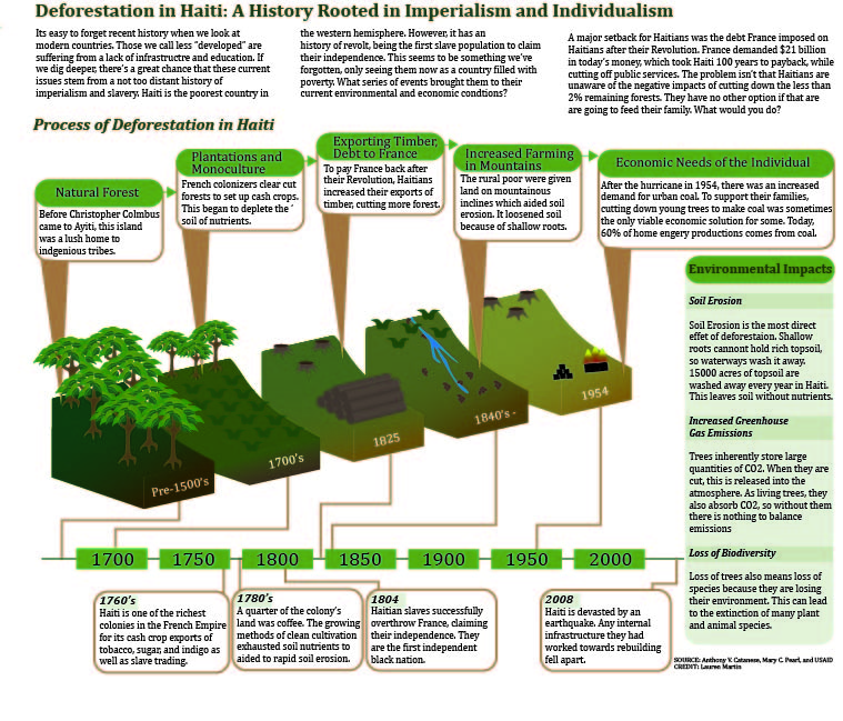
For my final diagram, I wanted to continue to build upon the knowledge I had built up about deforestation in Haiti from my first chart project. It was easier in this case to compile data and information because I checked out several books on deforestation in Haiti. It was pretty difficult finding raw data on deforestation in Haiti for the chart project, but working with the process was easier to find information on. I found a very in-depth report on rural poverty and environmental degradation in Haiti.

Since deforestation in Haiti is a complex issue, with interwoven political, social, and environmental aspects through history contributing to this top issue in Haiti I had a hard time trying to visually lay out all of these reasons. In news articles, I feel like the depth of why deforestation is plaguing the country has been overlooked, or barely touched upon. They tend to blame current generations for outrightly destroying the land, when in fact its much more of a build up of centuries of misuse of the environment from non-Haitians. Current Haitians are trying to clean up the mess more “developed” countries have left behind.

I started to web out my ideas to see the connections I was making. I started to realize how connected these events were on a timeline basis. I was able to hone in on this history of the country since its French colony days to the stem of deforestation. This is a point that most news sources don’t get into when they talk about the rampant poverty and degradation. The debt that France imposed on the Haitians after their revolution is also rarely mentioned, but a large part of why they began to export so much of their timber, because they had no other choice or face loosing their newly gained freedom.

From this point, I was able to create a web that connected these events, but I wasn’t sure how I wanted to communicate it visually. I tried creating my idea first on Illustrator, but Steve saw this was a bad idea because of my lost frustration. He suggested I sketch out my ideas, so I went through three drafts until I got to my final image which you can see. I started with separate 2d steps showing the land, then one connected 3d land mass that was divided by lines, than actually dividing up the sections to show a clear distinction. I used gradients to show the loss in green life and soil quality over time. I used a sloped surface because Haiti is very mountainous, which increases negative impacts like soil erosion more quickly.

The timeline was easily integrated, and also helpful to the reader but also discussing major events in Haiti’s history that would help give more background knowledge of what was happening in the country when these issues were occurring. The only information I thought this graphic was lacking was a section where I could get into more details about the detrimental impacts of deforestation in general, so I was able to fill the empty space to the right of the graphic with a sidebar with more indepth information on why cutting down trees is unsustainable.

I am pretty happy with how the overall graphic turned out. My information is strong, and I think I’ve made a usually misunderstood issue clear to the reader. This was my main goal. I think the color scheme goes well with the theme, and the 3D graphic is effective and strong. The timeline style works well with the overall imagine, and integrates other background information in nicely. Looking at it now, I do feel like its feels a little text heavy. I think the ratio of text to visual imagery is heavier on the text side, so I wish I had thought of ways to incorporate more images into it. Maybe icons for the timeline? Or side bar? Thoughts..

Overall, I think I accomplished my goal of communicating a complex issue in a true way, shedding light on how historical events had led to Haiti’s current state of poverty and environmental degradation.


Project 3, Mel Lent

This is my diagram project! I diagramed out a phone application that could exist, as a prototype map. I use it to demonstrate the customer journey (visualizing the steps the customer would take to use the application leading to purchase and receipt of goods), and to map the respective user experience. The goal of this application is to provide a unique fast-fashion approach to accessorizing through use of an application-centric commerce site, drones, and 3D-printing. Some of the current components (drones and 3D-printing, to be exact) would need to experience technological advances in speed and affordability for this business model to succeed, but that isn’t to say it couldn’t work out in the future after key advancements have been made!

I struggled a little with the perspective grid tool, but got better as I went, particularly with using it to modify text shapes. Eventually, I discovered I was just making everything more complicated, and that was the central source of difficulty for me.

I really like how this turned out! I know my color scheme is unusual, but I think it captures the flavor of the application. I am really proud of my progress with the perspective tools, such as those needed to make the phone 3D, as well as those needed to warp the text to fit. I really think this project got me to practice a range of techniques I learned in and out of class, and made me a stronger diagram-designer. I had a lot of fun designing my own application prototype as well through this assignment, from the top down. I think I learned a lot, and got to apply some of the things I’ve learned about branding across my coursework at IU. I also wanted to add that I left out the credit line because the idea was from me, and because ideally I’d feature this in media other than a newspaper where the credit line went above the graphic. This was fun!

This is my final project-- a step-by-step diagram of an app that does not yet exist!

This is my final project– a step-by-step diagram of an app that does not yet exist!

Plastic Water Bottles Make the Earth Thirsty

Thirsty Earth and Water Bottle

Click on the image for a fill size PDF version of my graphic.

My diagram is about water mining and plastic water bottle. There are many discussions about why bottled water is good or bad, or if people should drink tap water more than bottled water because of health, environment, and etc. However, there are not many discussions regarding water itself. I tried to focus on the side that is not talked too much about; how plastic water bottle that we consume because it’s convenient and taste good deplete water from ground and harms the environment to a point that the land loses its power to restore itself. I tried to show the process of water mining in a detail and just a little bit of a side note, I put a little bit of information on water bottle consumption. It was a subject that I knew nothing about until a few weeks ago when I talked with my friend who is very environment-conscious. I knew about landfill problems and health problems that are caused by plastic water bottle, but I never thought about the water itself. As I did research, I found many surprising, but natural fact that water in bottled water is mined from some place, not anywhere nearby where I live, and delivered to me. It was a simple fact but a bit shocking at the same time. I am obviously not the only one who drinks bottled water, and the bottled water companies that I buy bottled water from are huge multinational companies. Where does all the water come from?


I tried to find actual places where bottled water companies actually draw water, but it was not easy because it was more of inside issue. I did find some places, however, I decided to use just general information on aquifer because 1) I thought it was a better idea to give general information than focusing on one specific location’s information, and 2) it was hard to obtain specific information about the sites anyway.


I wish I could put more information on the diagram because there are so much more than a few sentences. I tried by best to put as much as information as possible regarding the process of putting diagram and the water cycle. I also feel like the color theme could be better, but it was the best I could. I did not want it to be too lively because water mining and depletion is a depressing issue. I also feel like I could be more clear on the connection between bottled water and water depletion, but I had to be satisfied with what I wrote on the article body due to lack of space. Another thing that I am not quite satisfied with is the water cycle drawing. I did my best, but it looks too simple.


I learned a lot from this project. For information-wise, I did not know anything about water mining and plastic, so I learned a lot for this project. I knew about the water cycle, but aquifer was a fresh knowledge for me. Regarding design, I definitely became more comfortable with illustrator. I drew a lot of icons, also, so I learned a lot about creating icons, having fun with lines and arrows.


Things that I like about my piece are 1) structure and 2) icons. Although I am not satisfied with the water cycle diagram, I like the rest of the drawings. I spent much time designing the icons and modifying them, but it was fun.


Overall, this assignment was the hardest one. I had a hard time to even pick the subject- I changed the subject four times; at first it was coffee, at second it was cold cases of children kidnap in Japan, and third was Korean traditional palaces. Although it was tough to complete the assignment, I like the result. I am personally happy to have a chance to learn illustrator. There is more than a plenty of room to grow, but compared to the beginning of the semester when I did not know anything about illustrator, I improved a lot. It was the hardest, but it was worth it, and I’m happy with the result.

Arsenic in Plants: How a Toxin Finds its Place and Wreaks Havoc in a Plant

Click on the image for a PDF version of my graphic.

Click on the image for a PDF version of my graphic.

I had a lot of fun making this diagram, and I think this time I picked a topic I could conquer in the time I was given to finish the graphic.

I find the subject of toxin contamination of soils and water to be very interesting, and I’ve learned more about it this year than ever before (through this class, a plant physiology class, and an inorganic chemistry class). Toxins in soil can have a massive impact on health. In areas where contamination is a major health issue, toxins can contribute to political and socioeconomic injustice. In areas where it is a minor issue, people still have reason to be concerned about it- metals in the body are no joke, and while some of them are necessary for life (Fe, Zn, Mg, etc.) others are very, very bad.

I am curious about how these bad metals get into our bodies – through water, air, skin contact, and food. This project tackles the food issue.

I chose arsenic because it is a fairly evocative toxin. People recognize the name and respond to it pretty strongly, so I thought it would have some news value. And I decided using an unambiguously bad element was a good idea. There are plenty of metals that are good in low doses but bad if the dose is too high- but I decided getting into that kind of detail would be too complicated for my diagram. That was a good choice.

I am happy with the overall look and layout of the diagram. If I made changes, I would shrink the soil and expand the sky just enough to put up a small map showing Bangladesh, or a small chart showing a) amounts of arsenic in agricultural crops (on the left of the stem) and another small chart showing b) the number of human deaths/year due to arsenic, or the number of people exposed to unhealthy levels of arsenic every year, by country (to the right of the stem).

I also would like to make the cutaway diagram more realistic and 3D-looking. I think it gets the point across, but it looks a bit chunky and amateurish.

I’m digging the roots, though.

The cutaway diagram doesn’t include all the parts of the root structure, but it does include the parts relevant for understanding how arsenic gets into the plant and travels through it, which is the point of the diagram.

I’d like to get into more detail about the actual mechanism of transport of arsenic through the plant. Like what exactly ferries it around? Some sort of protein or enzyme, or is it just dissolved in the water?

I did make a chart of the number of people exposed to unhealthy levels of arsenic every year, by country, but the numbers are just so astronomically different from one another that I decided to leave it out. It appears that arsenic poisoning is not really a worldwide issue; most countries do not have very high levels of As in the water and soil. Certain countries, however, do. Bangladesh has it worst, followed by Mongolia and Thailand. The numbers of people exposed were 30,000,000 in Bangladesh, 300,000 in Inner Mongolia, 2,000 in Thailand, and 300 in U.S.A. These numbers were just so widely different that I didn’t think a chart was that informative (even though I really really wanted to put it in).

For your interest, there is a curious reason Bangladesh’s numbers are so enormous. In the 1970s, humanitarian efforts were made to improve the water quality in Bangladesh, which at the time was suffering from a lot of water-borne infectious disease (due to pathogens). So relief organizations came in an helped dig a bunch of wells, all to more or less the same depth. Unfortunately, there happened to be a very high concentration of arsenic present at that depth- it is just a feature of the geology of the area. So all the water that comes from these wells has way too much arsenic in it, and the Bangladeshi people are continually poisoned by it.
So that is a problem.
One solution is to dig the wells deeper, so that they pass this arsenic layer. That will take lots of time, money, and labor, but it will help with the problem.
That’s my knowledge on the topic, I will read more about it and get a better understanding of what’s happening with that situation.

I really wanted to go more in depth with the specific effects of arsenic, biochemically, in both plants and in animals. I think that would be interesting, to talk about why it is so bad for humans. I was glad to explore the plant side of things, though, because a) plants are cool and don’t get enough attention or credit and b) it’s important to understand plant physiology if I want to understand how eating the plants affects human health. Know thyself, know thy food.

Feedback is appreciated, I am interested in pursuing this project further as well as applying a similar template to other toxins.

The Science Behind Craft Beer

Process

Click to see an enlarged pdf version.

I chose to create a diagram of the process of brewing beer not only because it is a family business, but also because I also think the process is something not a lot of people are familiar with and would like to be. Beer is a very popular drink and learning the process is something a lot of people would be interested in.

Many different aspects of the design just occurred because of the elements of I was given. I chose to create transparent pieces of equipment because it seemed to be less confusing to the reader to show what was happening after the ingredients were inside the tank instead of created a complicated set of diagrams and arrows representing when each ingredient was added. I chose to keep the interiors of the tank simple, again thinking that more detail would simply overcomplicate an already somewhat confusing process.

The large numbers, the overly large green arrow, and the light blue background were all included to add interesting design elements and break up the white space. Without all of those elements, the design seemed too white and empty for the topic I was representing. I chose the colors blue and green because they complemented the golden-brown color of the beer and created some contrast between the background the process. The numbers and arrow also work to clearly represent the order of the process.

Stress on the body

Click on the image for a PDF version of my graphic!

Click on the image for a PDF version of my graphic!

While I was trying to come up with some sort of process the I could visually represent, I couldn’t help but think to myself, how stressed I was. After a couple of days of contemplating ideas, it finally hit me. I decided to do an annotated and process diagram of how stress affects the body. I narrowed it down to the five major systems or areas that become compromised when the body undergoes stress. I started with the brain, then heart, the digestive system, the immune system, and finally the muscles. In each step I explain how this part of the body is effected by stress.

Personally, I found the idea of creating icons to be the most fun when it came to the diagram project. I could have done a cutaway version of the body explaining what happens inside the body when stress occurs, however I loved the idea of creating my own depictions of the body parts and adding a little but of design and color to them. I wanted to create a graphic that was clear, concise, easy to follow, and somewhat modern and simplistic.

Project 3 – Northern lights diagram

NorthernLights For this project I decided to create a graphic of how the northern lights are created, and a scale to show what causes the different colored lights.

I’ve taken a few astronomy classes so I was familiar with the creation of the northern lights. I traced the countries on the earth from a picture taken from google, and I knew what solar flares looked like so i drew them from memory.

I used the gradient mesh tool on the sun to get the effect of the sun being on fire, for the rest I used the pen tool. The scale of the colors I created with the square shape and the gradient tool.

I think I did a good job of clearly showing the process of how the northern lights are created for those who aren’t familiar with the sciences. This graphic was created with a textbook in mind which is why it has more of an educational tone to it.

Breaking down the tea bag assembly process

Diagram_Torres

Click on the image to see the full graphic.

I drink a lot tea, so I thought it would be interesting to research the process tea leaves go through in order to end up in the packets I use to make my chai tea every morning. I was luckily able to find a website that offered detailed descriptions of just that. Along with them, the site also provided reference diagrams, which were really helpful. There was, however, somewhat of a disparity between the two, so I had some trouble at first distinguishing which steps went with each description. (Some steps had diagrams, while others didn’t and there were additional diagrams that weren’t really explained in the text.) I ended up combining some and breaking up others.

As for the actual illustration of the process, it was relatively straightforward. There were some steps that required me to do cut-away diagrams, which is something I don’t have too much experience with. I think the method I chose to accomplish them worked out well, though. In addition, drawing the small tea leaves was tedious for some of the tips, but once I drew them once, I was able to reuse them in other places.

Overall, I’m happy with how my diagram came out. I think each step is pretty easy to understand and pleasant to look at.

Hyzy diagram project

Hyzy_diagram projectI did my diagram project on the acidification of the Great Lakes and how that affects wildlife.

This is a topic that I’ve already researched for other classes and for the IDS. As an environmental management minor and a Great Lakes-area native, it’s very interesting to me.

I struggled to find a way to clearly illustrate such an abstract scientific concept, but in the end I feel I did so effectively.

The hardest part was the formation of a weak acid. I wasn’t sure how far into chemistry would be appropriate to go, so I went for the bare minimum. It was also a challenge to illustrate the native clams and the zebra mussels, since their only consistent difference is the color and a slight change in shape.

Pointe Shoe Diagram

Click on the image for a PDF version of my graphic.

Click on the image for a PDF version of my graphic.

I took a lot of time to decide on a topic for this final project. I was bouncing ideas for a long time but decided to go with something I was passionate about. I’ve been dancing since I was about three, but unfortunately that came to a halt when I got to college. I miss it a lot and I’m always interested in learning more about the art of dance so I chose an aspect of ballet for this diagram. This piece is a cutaway diagram that shows the inside of a pointe shoe. I wanted to show the main parts of the many that go into producing just one shoe.

Since I was never trained intensely in ballet, making this diagram on pointe shoes taught me a lot. I wasn’t aware of some of the terminology used, and didn’t know how much went into producing the shoe. I love watching ballet because of how effortless it looks, while knowing how intense ballerinas train to achieve this effect. After completing research for this project, I appreciated pointe shoes in the same way. They look so dainty and pretty, covered in pink satin. If you look up close, you can see that they are actually very strong and each pair is very carefully crafted.

I had a difficult time finding a way to lay out all of the information in my graphic. I felt that no matter what I did the page looked crowded, so I played around with different colors and positions. I wanted to make sure the illustration of the shoes were the main focus, but needed to find a way to incorporate all of the descriptions and additional information. I ended up choosing lighter pastel colors because I thought they went the best with the color of the shoes, and portrayed the feeling I get when I watch ballet.

Overall, I’m happy with how everything turned out. I thought I used a lot of what we learned in our class, especially the pen tool! Of all the assignments, this was my favorite to create. I hope to continue to use the skills I’ve learned in this course in the future. I think they could be extremely helpful whether I end up in a design field or not.