The Science Behind Craft Beer

Process

Click to see an enlarged pdf version.

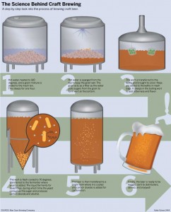
I chose to create a diagram of the process of brewing beer not only because it is a family business, but also because I also think the process is something not a lot of people are familiar with and would like to be. Beer is a very popular drink and learning the process is something a lot of people would be interested in.

Many different aspects of the design just occurred because of the elements of I was given. I chose to create transparent pieces of equipment because it seemed to be less confusing to the reader to show what was happening after the ingredients were inside the tank instead of created a complicated set of diagrams and arrows representing when each ingredient was added. I chose to keep the interiors of the tank simple, again thinking that more detail would simply overcomplicate an already somewhat confusing process.

The large numbers, the overly large green arrow, and the light blue background were all included to add interesting design elements and break up the white space. Without all of those elements, the design seemed too white and empty for the topic I was representing. I chose the colors blue and green because they complemented the golden-brown color of the beer and created some contrast between the background the process. The numbers and arrow also work to clearly represent the order of the process.

Indiana Basketball

MAP_GRINER

Click to enlarge!

Indiana has always been known as a basketball state, and I wanted to prove that to be accurate with this graphic. I wanted to create a graphic that showed how many basketball players each state produced. I would have loved to have collected data from all Division I NCAA basketball teams, but time did not allow it. I instead chose to take data from only the AP Top 25 teams. When I collected the data I found that Indiana did produce the most basketball players, second to only California, but California also had a much higher population, which I adjusted for in the top graphic.

Overall, I’m very happy with the way that my graphic turned out. I chose orange as my main color because it is the color of a basketball. I also chose to include the locations of each Top 25 team because those locations definitely have an impact on where players are coming from. I was worried that it would make the map look too busy, but I also think it was necessary to include the information. I also chose to include smaller graphics showing the raw un-adjusted data and where each Indiana player was from to add more context. One of the major ways I think I could have improved my graphic would be by simply collecting more data. Perhaps either data from every team, or data from multiple years would have been beneficial, but doing so would have also made it more complicated.

U.S. eBook sales holding steady

Charts on book sales

Click the image to see the full graphic

As a student double majoring in English and Journalism, I often get people asking me what I want to do with my future if I don’t teach. I reply that I want to go into book publishing, and most of the time people respond with warnings that the print book and news industry is dying and that I should focus my time and efforts in the digital world. Because of this, I wanted to make a few charts representing just how much the introduction of the eBook and digital publishing is influencing the publishing industry. I was curious as to whether eBooks really were taking over and becoming the norm.

The first issue I found after choosing this topic was collecting data. I would have preferred to have data that went all the way back to the introduction of the eBook, but could only find detailed data for 2014. When I did manage to find the data, it didn’t tell me much. It basically showed that eBooks are a relevant and important part of the market, but they still haven’t overtaken print books and don’t appear to be poised to do that anytime soon. So my challenge was to take data that was showing that nothing was really changing in the market and make it newsworthy. I decided to make the point that nothing is changing the newsworthy aspect of the data. I wanted to show that eBooks were important to the publishing industry, but they don’t appear to be causing the death of the print book anytime soon.

Overall, I am generally happy with my graphics. I only wish I would have been able to find data that goes further back to really show the full eBook trend. I also like that I represented the pie chart as a stack of books, but I would have liked to represent some of the data more creatively.